Cracking the Secret to a Good Visualization
Let's begin with understanding what data visualization is all about.
In simple words, data visualization is the art of transforming quantitative data into visuals that are easier for the human brain to grasp and understand.
Believe it or not - Data visualization is the new storytelling since it is one of the most powerful modes to communicate data through visuals. When done right, it delivers information which leads to good decision-making, but when done wrong, it can lead to muddled conclusions which in turn can hamper your business.
The goal of this blog post is to give you a clear idea of the concepts that make a good visualization.
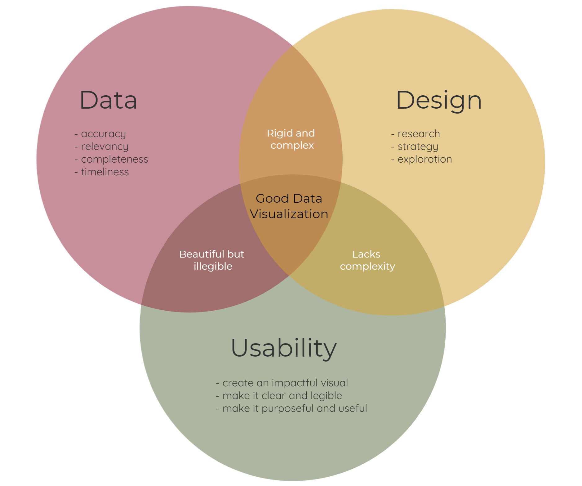
1. Start off by asking the fundamental question - Do I have the required data?
You might have heard how valuable data can be - to improve business processes and to make better decisions. However, there's an admonition - data is valuable only if it's of high quality. So, how do you measure your data quality?
There are 5 main criteria to measure your data quality:
a. Accuracy - This is one of the most important aspects of data quality. For data to be accurate, all the values must be represented in a consistent and unambiguous form. This prevents confusion and guarantees there is no ambiguity when analyzed by a computer.
b. Relevancy - Data relevancy is the degree to which the information being gathered meets the purpose for which it is gathered. It should indisputably report all the positive and negative information. Only then, it can act as the ace of spades.
c. Completeness - Incomplete data is as dangerous as inaccurate and irrelevant data. Gaps/missing fields in data collection leads to partial view of the overall picture. Therefore, data owners must ensure there is no data missing from the dataset. Setting up automation to check data gaps and duplicates will help you avoid time wastage.
d. Timeliness - Timing is everything when you're collecting, analyzing, and visualizing data. If a business looks into outdated data, even if only for a few weeks or months, it can make a huge difference. Hence, having up-to-date data is as important as having accurate data.
2. There is no need to explain the significance of data to yourself when you're the data owner. However, for the larger audience you must provide a clear explanation of what the data is about, and that’s where a good design comes into the picture.
"Information graphics should be aesthetically pleasing but many designers think about aesthetics before they think about structure, about the information itself, about the story the graphic should tell" - Alberto Cairo
Compelling visuals should involve the following design principles:
a. Research - When starting a project and trying to find out what the solution could be, we need to conduct research to get the inspiration for an answer. The goal of design research is to help us understand the limits of various standards and guidelines for creating powerful visualizations. For that, start asking the right questions -
- What information do you want to communicate?
- Who are our audiences?
- What is their level of numeracy and visual literacy?
- How much time your audiences can spend?
- How much precision is required?
If you stop and think about these questions, this is pretty ambitious target! And once you've answered these questions, start planning and designing solutions in a way that aligns the interests of the audience. After all, design research is all about covering a wide variety of topics from observation to memorability, from simple/complex frameworks to hypothesis about what comprises a chart.
b. Strategy - Building a design strategy requires you to create the corporate strategy around design thinking and human-centered design approach. Start by developing a framework towards how you want to organize the data, so that, it is understandable, techniques to create enticing visuals, systems to store the data, and finally the tools to deliver them.
Our eyes are naturally attuned to search for things that stand out. And with a design strategy in place, you can influence how your data will be processed and experienced.
c. Exploration - Now that we've a got a clear idea of what research needs to be conducted and what strategy needs to be developed, it's time to conceptualize ideas and promote creativity and innovation within yourself. This is where tools like GitMind can be used to create wireframes. Once you've got these wireframes in place, start working on visual cues by choosing apt color, form (lines, dots, and shapes), depth (space, size color, lighting, and textural gradients), and movement.
3. Lastly, a good user experience depends on usability i.e. how well the end user can use your visualization to achieve a defined goal effectively.
Now that you have the required data, research, strategy, and design exploration in place, it's time to create an impactful visual. Break down complex pieces of information into visual representation that is cleaner and easier to understand. Format information into digestible bits - add annotations, so that, the end user can easily identify and pick out the most useful pieces of information.
Most businesses need to derive insights from huge amounts of data on a daily basis. They spend hours to crunch data and produce reports or briefings just to ensure that they can be digested by their clients and colleagues. We all might agree that crunching data is important. However, it is not enough - you need to be telling stories in the form of visuals. A good visualization saves time and makes it easier to identify trends and patterns which otherwise is difficult when you're reading a report with hundreds of pages.