Nasdaq Composite Index
The visualization in the form of Candlestick chart below shows the daily high, low, open, and close of the stock.
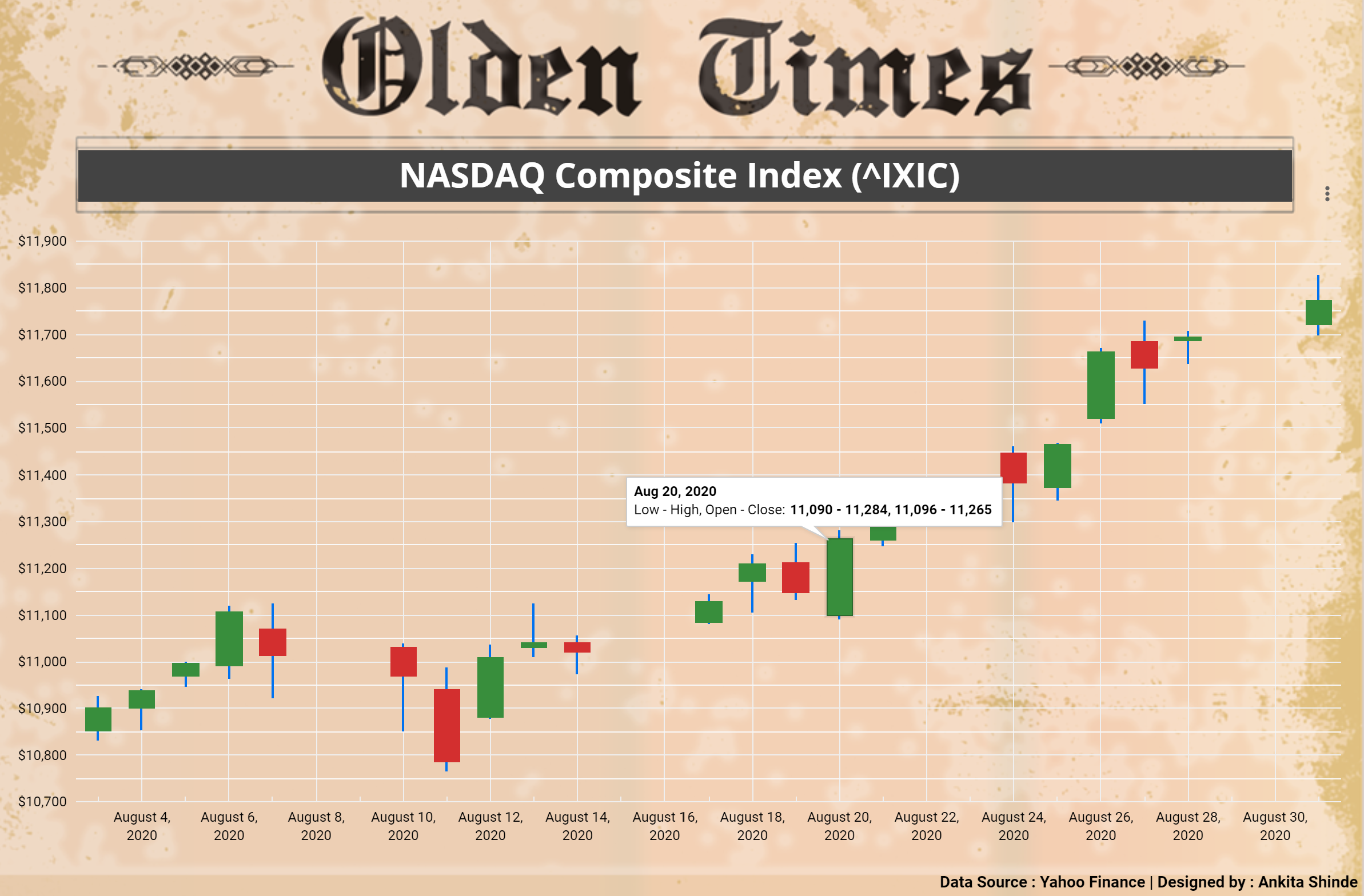
Nasdaq Composite gained 9.59% in August, its best summer showing since August 2000. This climb was driven by prospects of a prolonged low-interest-rate environment.
View the interactive visualization here.How to read Candlestick charts?
The image below represents three specific points (open, close, wicks) used in the creation of a price candle.
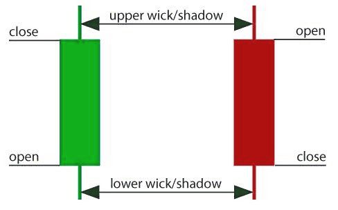
These points identify where the price of an asset begins and closes for a given period and will build the body of a candle accordingly. Each candle portrays the price movement for a specific period. If the chart looks into the daily stats then each candle will display high, low, open, and close wick of that day.
- Open Price - This represents the first price traded while forming a new candle. If the price is trending upwards, the candle will turn green and if the price is trending downwards, the candle will turn red.
- High Price - The top of the upper wick points out the highest price traded. If there is no upper wick, it means that the open or close price was the highest price traded for that day/given period.
- Low Price - The lowest price traded is the price at the bottom of the lower wick and if there is no lower wick, then the lowest price traded is equivalent to close or open price.
- Close Price - This is the last price traded during the candle formation. If the close price is lower than the open price then the candle will turn red and if it is higher than the open price, the candle will turn green.
Note: The color formation depends on the chart settings.