Dataviz Books for Beginners and Beyond
1. Do you want to learn about data visualization's history, theory, principles, and more?
2. Do you want to create effective visualizations that tell a story?
3. Do you want inspiration from stunning visualizations?
Here are a couple of books that I have found invaluable and highly recommend to anyone who wants to gain a deeper understanding of data visualization.
1. Storytelling with Data : Cole Nussbaumer Knaflic
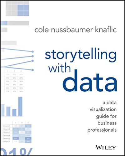
If you're new to the data visualization world, then this book is a must read as it covers the fundamentals of data visualization. The structure of this book is oriented towards pragmatic data visualization where the author uses real-world examples to explain how to effectively communicate data to your audience. These examples also show ordinary graphs/charts can be enhanced by reducing clutter, using better color combinations, and other standard tricks.
The USP for me is the way Nussbaumer Knaflic introduces a first version of a dataviz, then walk through her thought process of eliminating clutter and emphasizing on just the key information, thus telling a story. She finishes the book by focusing on the fact that it is important to iterate and modify designs and test them on various audiences to see how they interact with the visualization.
In summary, I definitely recommend "Storytelling with Data" as it gives you a different perspective on what data to present and how to build a story across that data.
2. The Visual Display of Quantitative Information : Edward R. Tufte
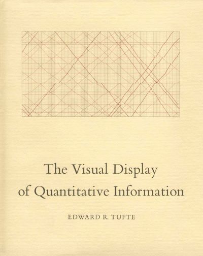
The theme of this book is to be able to represent complex data using simple graphics. Tufte also provides the history and evolution of various graphs such as time-series, maps, and narratives or stories. This book is basically about graphical representation of data where Tufte introduces theories, terminologies, and how to communicate complex ideas with clarity and precision to maintain graphical integrity and excellence. It explains the reason for poor quality of data graphics : where one transfers the design ownership to those with formal art/design training but without an understanding of statistical methods to analyze the data.
The author also provides suggestions and examples on how to design box plots, bar graphs, and scatterplots. What I loved the most is the author's idea of a "range-frame" where you draw the x and y axis on a scatterplot, but only in the range where the data is present.
If developing data graphics is a part of your routine, then this is an essential addition to you book collection. Because after reading, you will likely look at data graphics with an eagle eye and learn to establish a structured process for creating efficient data graphics.
3. The Functional Art : Alberto Cairo
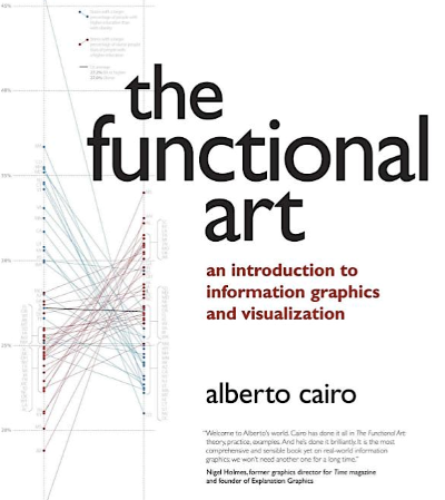
This book is a perfect blend of statistics, design, and data journalism that weaves visualization theory and techniques with real-world stories and interviews about existing visualization projects. As you flip though, you'll notice a ton of examples and pencil sketches with an explanation of the process.
The first section of the book lays the "foundation" and explains the benefits and techniques to a good visualization. Important points are displayed in bold text which makes it easier to spot.
The second section covers "cognition" i.e. it explains how human brain perceives different visuals in the form of color, shape, size, etc.
The third one is a "practice" section where the author provides diverse case studies and interactive graphics with the process behind it. I love when authors explain their process behind a beautiful end result as it helps you understand the effort it takes to create a stunning visual.
The last section "profiles" is a collection of interviews with some of the luminaries of the data visualization space: Hans Rosling, Jan Willem Tulp, Hannah Fairfield, Geoff McGhee, and Juan Velasco, to name a few.
In summary, this book does a fantastic job of clarifying the dynamics behind visual design. Something that I acknowledged the most about the author is that, he brings academic visualization concepts into his book with great examples, making it truly valuable to a wide range of audience.
4. The Truthful Art : Alberto Cairo
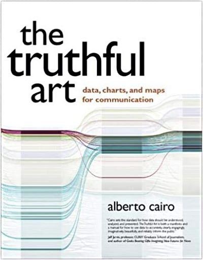
This book comes in handy when you want to visualize data in a way where anyone can understand and make data-driven decisions. The author starts with a basic introduction to statistics and visualization. It includes how to utilize different charts and graphs to explore and extract insights from your data. Every now and then statistical concepts such as confidence intervals, error margins, and hypothesis testing are explained in a simple language. But some chapters dig deeper into certain concepts of statistics, like correlation, regression, distributions, statistical significance, etc. The book is also loaded with beautiful examples of maps and tips on how to avoid common data pitfalls.
Most of these concepts and techniques were already introduced to me while pursuing my Masters. However, I still found it to be valuable as it helped me apply some of these concepts while creating data viz projects.
If you're a data journalist or data visualization designer, then this book is a must read as it helps you understand and lay the foundation towards a good visualization. It will also help you understand how data viz experts think while creating stunning visuals.
5. The Big Book of Dashboards : Steve Wexler, Jeffrey Shaffer, and Andy Cotgreave
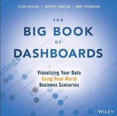
When you want to build a dashboard to summarize your findings, where do you start? Do you just combine a set of charts or scorecards and call it a dashboard, without even knowing the techniques or best practices? If your answer is "Yes", then you should grab a copy of this book. Because this book starts with practical design advice and then moves to 28 real-world case studies with best dashboard designs in practice.
The early chapters cover data types, encoding data, color coding, preattentive attributes, and common chart types. This acts as a foundation to understand the case studies.
The latter chapters are filled with dashboards addressing different industries and platforms (desktop, tablet, smartphone, and print) with a detailed analysis of which visual/chart "works" and which "does not". Further, the case studies discuss the common business situations encountered by analysts and this section is the meat of this book. The authors also discuss about the iterations some of the dashboards went through and why the final forms were more successful.
Overall, if your focus is to overcome business problems through design, regardless of the tools you use, then this book should be on your reading list.
6. Resonate : Nancy Duarte
The theme of this book is "persuasion." It explains how to understand your audiences', create persuasive visuals, and build a presentation to grab their attention. Duarte emphasizes that in order to develop a deep connection with your audience, it is important to have an emotional allure to introductions and presentations, not just presenting statistics.
Using the fundamental concept of storytelling that resonates with your audiences' is one of the most incredible methods to evoke emotional responses. You create desire and build trust and credibility through stories that drives people to adopt your perspective. The author presents her ideas through graphs, charts, illustrations, photographs, and case studies so that the reader understands the broader meaning of her message.
However, the book utilizes audience analysis heavily only in the early chapters i.e. until chapter 4. In the later chapters the author discusses on how to select, organize, and structure meaningful content. I think there's an opportunity to highlight that audiences' requirements should drive the selection, organization, and structure of the content. Apart from that, I think this book serves as a brilliant guide to anyone who communicates and persuades on a daily basis.
7. Understanding the World : Sandra Rendgen
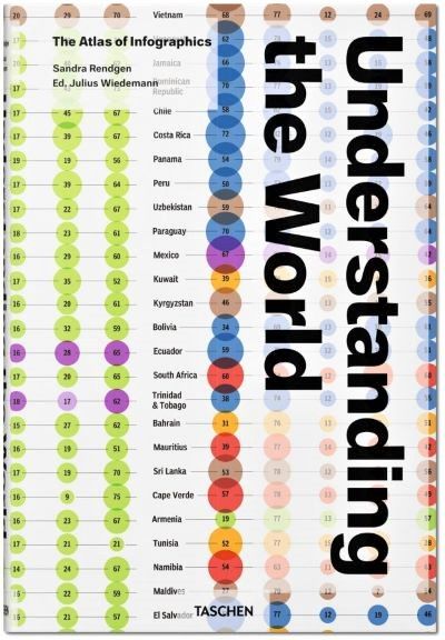
This is a beautiful giant book that utilizes artistic design to convey information that everyone can understand. This book is divided into 5 chapters - environment, technology, economics, society, and culture to explain complex problems in the form of infographics. You'll love and enjoy turning each and every page of this book because every piece of infographic is stunning, unique, and loaded with information. This book is a great resource if you want some inspiration while trying to visualize your own data.